
ROLE
-
Led user research to understand design use cases and user needs.
-
Collaborated closely with engineers to continuously enhance AI output quality, relevance, and usability.
-
Shaped the user experience around the AI system to drive higher engagement and adoption.
TEAM
-
1 Product Designer (me)
-
2 Engineers
-
1 QA
PROBLEM
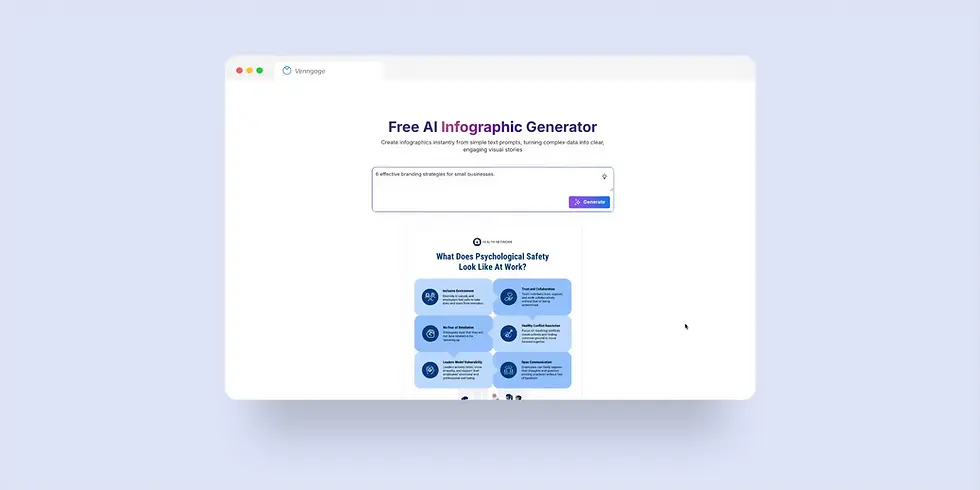
Venngage is a design platform built on a strong foundation of customizable templates for business communication. As AI tools became more accessible, we saw an opportunity to streamline the design effort by helping users convert text into infographics—instantly.
We launched an AI design generator based on a simple premise: auto-populate templates with AI-generated content according to the user’s input. The foundation seemed solid, but early adoption was low, and feedback was negative:
-
Only 25% of users created an AI-generated design
-
60% of users rated the tool poorly
PERSONA
To shape the redesign strategy, I conducted prompt analysis and discovery calls to identify who we were really designing for. I found two key personas:
-
Ethan, a content marketer who needs simple yet polished infographics for blogs and emails
-
Alex, an HR manager looking to transform lengthy, mundane training materials into engaging visual content
The main challenge for both Ethan and Alex was the inconsistent quality and the mismatch between their intent and the AI-generated outputs, which undermined their trust and willingness to adopt the tool.
Ethan Brooks
Marketing Content Creator

GOALS
NEEDS
CHALLENGES
Create quick, visually appealing infographics
-
Inputs short and topic-based prompts
-
Shares visuals on social platforms or blogs
-
Want a good starting point with minimal editing effort
-
Visuals often miss the mark
-
Output doesn't match the content intent
Alex Rivera
Human Resource Manager
GOALS
NEEDS
CHALLENGES
Turn long-form content into quality infographics.
-
Inputs detailed outline or full documents
-
Requires word-for-word accuracy
-
Shares visuals for onboarding or training
-
AI misinterprets or over-summarizes details
-
Lack of flexibility, making editing difficult
pain points
I tested the tool with real user prompts to pinpoint where it fell short. While it simplified the workflow, there was a clear gap between user expectations and the actual output. The most common issues were:

Incorrect Structure
Prompts like “7 Key Business Metrics” often resulted in layouts displaying only 3–4 points.
Mismatched Content and Oversimplification
AI summarized and generated content just to fit the template, without fully understanding the user’s intent.
Poor and Random Visuals
Images or icon are completely irrelevant to the design content.
How might we...
help non-designers effortlessly transform their ideas into quality, visually compelling infographics?
User Objective
Help users turn their text content into quality visual infographics that match their expectations.
Business Objective
-
Improve overall user satisfaction with AI-generated designs
-
Increase engagement and adoption
BREaking it down
To understand the root causes behind the poor outputs, I broke down the full generation pipeline and identified three major issues:
-
Random template selection that didn’t fit the prompt’s structure or content type
-
AI-generated text based solely on topic, missing user intent and producing mismatched tone
-
Vague keyword matching that pulled irrelevant icons and images
These three areas—structure, content, and visuals—became the foundation of the redesign efforts to improve relevance and quality.

STEP 1 /
Match Intent to Structure
Analyzing thousands of prompts revealed four common content types: Informational, List, Process, and Statistical. I mapped each to a specific layout format to guide more accurate template selection.
A key challenge came up with List and Process prompts, where users often specify an exact number of items, such as “5 key business metrics.” While the AI understood the intent, it wasn’t accounting for layouts that could visually support that number.
To solve this, I partnered with engineers to introduce a smarter, layout-aware system using Gemini’s multimodal text and vision capabilities. This system interprets both the prompt’s semantics and template structure to ensure layouts align with user content and expectations.

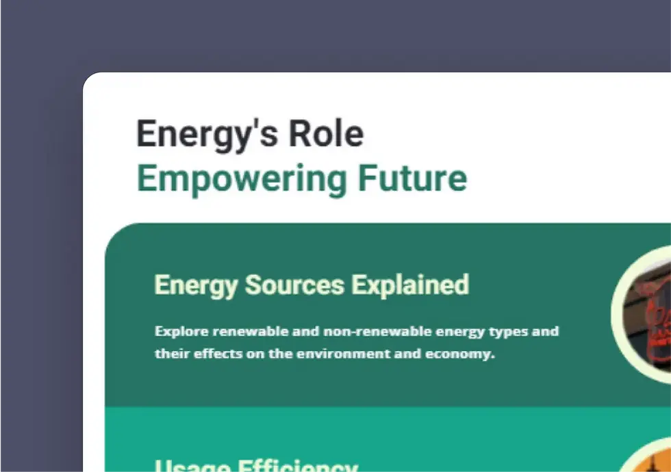
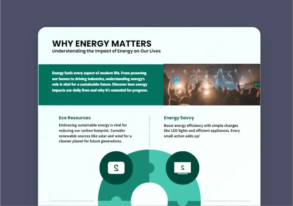
Informational
Example: “Advantages of company training software”
Purpose: Explain a concept or idea clearly.
Visual Layout: Sectioned explainer with icons/ images
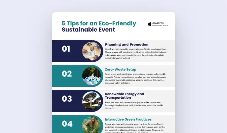
List
Examples: “5 tips for an eco-ffriiendly sustainable event”
Purpose: Organizes and displays key points
Visual Layout: Numbered list or grid layout

Process
Examples: “4 steps B2C delivery process”
Purpose: Show process or a sequence.
Visual Layout: Step-by-step vertical or horizontal flow
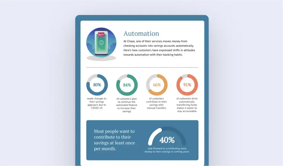
Statistical
Example: “80% made changes to their savings approach...”
Purpose: Present data and highlight key numbers.
Visual Layout: Data blocks with chart/percentages
STEP 2/
Align Content Style and Writing Tone
Many users found the AI-generated text off-topic, filler-heavy, or inconsistent with their intent. I defined a set of tone and style guidelines and embedded them into the generation pipeline. This helped reduce hallucinations and made the content feel more aligned and purposeful.
List
Tone: Concise, benefit-driven, engaging
Purpose: To deliver digestible information quickly, often around a theme or goal.
Style: Focus on reader value or utility
Process
Tone: Clear, actionable, instructional
Purpose: To teach how to complete a task or achieve an outcome.
Style: Use active voice and imperative verbs and be precise
Informational
Tone: Neutral, explanatory, objective
Purpose: To educate or clarify a topic without persuasion or opinion.
Style: Use simple, jargon-free language and third-person voice
Timeline
Tone: Objective, chronological, informative
Purpose: To present key events, milestones, or developments over time in a clear, linear format.
Style: Prioritize major milestones over minor events
Statistical
Tone: Formal, analytical, data-backed
Purpose: To inform readers using verified data, often for decision-making or insight.
Style: Use precise, unambiguous language. Avoid exaggeration and let the data speak.
STEP 3 /
Fine-Tuning Visual Quality
Visual mismatch was another consistent complaint. Users felt poor icons and images undermined the design quality. We test many text-to-image models and refine how icons and images were created in the designs:
Image Generation
We built a generation pipeline where an LLM generates context-aware prompts, then passes them to a text-to-image model—ensuring visuals match surrounding content.
Semantic Icon Search
We switched from basic keyword matching to LLM-powered semantic search, resulting in more contextually relevant icons.
Updated Generation Pipeline
A key part of this upgrade was shifting from a single-model system to a multi-model collaboration approach, where each model contributes its unique strengths to improve the overall output. Gemini handles layout reasoning and text generation. GPT-4o creates semantic descriptions that are passed to Flux's text-to-image model to quickly produce visual assets.
These models work collaboratively to deliver outputs with:
-
More accurate layouts that reflect prompt structure
-
Better content quality with reduced filler and improved tone
-
More relevant visuals that elevate design polish

CHALLENGES & Solutions
CHALLENGE 1 /
Lack of Feedback and User Control
We saw a 20% increase in adoption after the improvements, still below expectations. I investigated further by analyzing behavioural metrics and ran usability tests. I found that users often felt uncertain and lacked control during the process. There was no feedback while waiting, and once their design finally appeared, there wasn’t a clear CTA for users to act on which leading many to drop off.
Version 1: Loading State
The original UI featured only a “Generate” button without any progress indicators. I redesigned the loading state to provide clearer feedback, including:
-
A progress bar showing status with an option to stop generation
-
A real-time skeleton preview
-
A prominent “Customize” button after generating
-
A quick survey for users to share feedback after rating
These changes gave users a tangible sense of control and helped reduce uncertainty.


Version 2: Preview Modal Experiment
After launch, I collected qualitative feedback through surveys and session recordings. Many users were frustrated by default colors and styles and struggled to preview the output without excessive zooming or scrolling. I then A/B tested a new preview modal with zoom controls and light customization options like styling selection.
Results
The modal led to a 16% relative increase in creation rates, and 20% increase in registration rate.
By adding thoughtful UX touches, such as a streamlined preview modal, interactive controls, and lightweight customization, I gave users a clearer sense of control and a more engaging experience. Surprisingly, these changes had a bigger impact on adoption than the quality improvements alone, which showed me how crucial it is to build strong UX around AI tools.
CHALLENGE 2 /
Inflexibility of Static Templates
The template-based generation worked well for users like Ethan, who needed quick, polished infographics from short, topic-based prompts. But it fell short for users like Alex, who needed precise, structured outputs. It couldn’t structure long-form content within fixed layouts or preserve word-for-word detail.
Dynamic Infographic Generator
We rethought our approach and built a more autonomous generator that can adapt to a wider range of use cases and allows AI to have creative freedom.
Powered by Claude, this new system is able to understand nuanced instructions, content structure, and user goals. Combining defined guidelines with multi-step reasoning, it generates flexible and responsive designs from scratch. The designs are then rendered into our editor, allowing users to easily customize them. This approach streamlines the design process by providing smart, customizable, helping users reach 90% completion with minimal effort.

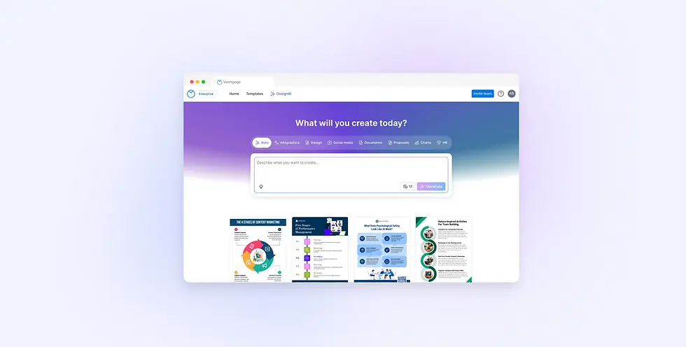
A Universal Generator for Every Design Need
As users began requesting more than just infographics, like posters, reports, and presentations, it became clear there was no one-size-fits-all solution. I led the effort to design a Universal Design Generator: a smarter system that can adapt to any prompt and generate a variety of design types.
Instead of asking users to choose the right tool, we let the LLM handle the heavy lifting. It interprets the prompt, selects the appropriate design category, and routes it to the most effective generation path, whether template-based or fully dynamic. This makes the experience more intuitive and accessible for non-designers. All they need to do is enter a prompt, and the AI delivers quality designs.
.webp)
IMPACT
The improvements helped reduce friction, improve trust, and better align AI outputs with user expectations. As a result, we saw clear improvements in both satisfaction and adoption:
-
User adoption rate increased by 40%, growing from 25% to 35%.
-
35% increase in satisfaction rate
-
The AI design generator not only became the leading top-of-funnel feature for user acquisition and conversion, but also improving retention.
learnings
Using the Right AI for the Job
Our pipeline leverages multiple LLMs (Gemini, Claude, OpenAI GPT), each carefully tested and selected for their strengths in understanding user intent, generating layouts, or creating visuals. Choosing the right model for each specific use case was key to building a system that is both flexible and powerful.
Design x Engineering Collaboration
Working closely with engineers was critical to our success. I translated user problems into clear design requirements, while they provided deep insights into model behavior and technical constraints. Their expertise helped shape the product strategy and ensured we balanced feasibility with user needs.
Designing AI with Empathy and Clarity
Designing AI-powered tools goes beyond functionality—it’s about humanizing invisible systems and building empathy. It’s not just the quality of the AI itself that matters, but also the user experience around it. By redesigning the flow to emphasize clarity and guidance, I was able to positively influence user behavior and increase engagement. I believe designers now play a vital role in making AI systems feel transparent, approachable, and aligned with real human needs.